

Tahoe looks different, and for a lot of people it looks harder to read. Sidebars glow through windows, the menu bar has vanished into the wallpaper, and app icons have gone strangely pale. The good news is that a handful of toggles fix most of it, and a few others switch on features Apple buried.
These are the macOS Tahoe settings to change first, in the order that gives you the biggest improvement for the least effort. Every path below is exact, so you can work through them in about ten minutes.
Check Your macOS Version Before You Touch Anything
Almost every guide online skips this, and it wastes people hours. The Reduce Transparency switch, the single most useful setting in Tahoe, was broken for months.
In macOS 26.1 and 26.2 the toggle left sidebars, headers, title bars, and search boxes just as transparent as before. People flipped it, saw barely any change, and concluded the setting did nothing. As OS X Daily reported, macOS Tahoe 26.3 fixed it, and the toggle now properly strips transparency from those areas.
Open the Apple menu, choose About This Mac, and read the version number. Anything below 26.3 means updating first. You can confirm the current release on Apple’s security releases page, and our guide on whether to update explains how to judge that decision on any Apple device.
macOS Tahoe Settings to Change First: Tame Liquid Glass
Start here, because this one change does more than the other nine combined.
Step 1: Turn on Reduce Transparency
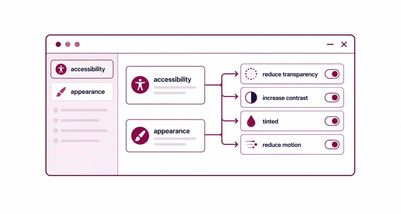
Open System Settings, click Accessibility in the sidebar, then Display, and find Reduce Transparency in the Vision section. It ships switched off. Turning it on makes the menu bar, Dock, Control Center, sidebars, and toolbars solid instead of see-through.
Step 2: Add Increase Contrast if text still swims
The same Display panel holds Increase Contrast. It draws outlines around interface elements and sharpens the boundaries between them. Paired with the first setting it produces a noticeably crisper, higher-contrast desktop.
Step 3: Try Tinted before you give up on the look
If you like the glass effect but not the glare, open System Settings, then Appearance, and choose the Tinted option under Liquid Glass. Frosted rather than clear, it keeps the character without the readability problem.
Step 4: Reduce motion if animations bother you
Back in Accessibility, open the Motion section and turn on Reduce Motion. Windows and menus then appear rather than sliding, which also helps on older hardware.
| The Setting | Where It Lives | What It Fixes | ||
| Reduce Transparency | Accessibility, then Display | See-through menus, sidebars, and toolbars | ||
| Increase Contrast | Accessibility, then Display | Faint edges between interface elements | ||
| Tinted Liquid Glass | Appearance | Glare, while keeping the new look | ||
| Reduce Motion | Accessibility, then Motion | Sliding animations and window effects | ||
| A Quick Note Apple gives you no single switch that restores the old pre-Tahoe interface. Some Liquid Glass remains no matter what you change. These four settings between them remove most of the parts people actually complain about, which is as far as the operating system currently lets you go. | ||||
Bring Back the Menu Bar Background
Tahoe made the menu bar transparent by default. Your wallpaper now runs straight through it, and the icons float unattached at the top of the screen. Plenty of people find that disorienting.
Open System Settings, click Menu Bar, and turn on Show Menu Bar Background. The bar reappears, tinted with the dominant color of your wallpaper. Want the plain gray bar from earlier versions of macOS instead? Reduce Transparency from the previous section gets you closer than this toggle does.
Fix Your Icons Before They Become Unreadable
Tahoe brought iPhone-style icon theming to the Mac. Open System Settings, then Appearance, and look for Icon and Widget Style, where you can pick Default, Dark, Clear, or Tinted.
Choosing Default returns you closest to how a Mac used to look. The other options are genuinely fun, but they carry a real cost. Howard Oakley at The Eclectic Light Company points out a real trap. Many combinations of appearance mode, accessibility settings, and icon style leave icons almost impossible to tell apart. Clear and Tinted are the usual culprits, especially alongside a strong tint color.
| The Golden Rule Change one appearance setting at a time and use your Mac for a day before changing another. Stacking a tinted icon style on top of dark mode and increased contrast is how people end up with a desktop they cannot read and no idea which setting caused it. |
Turn On Clipboard History, the Best Hidden Feature
Tahoe finally gave macOS a clipboard that remembers more than one thing. Windows and Android users have had this for years, and it changes how you work once you trust it.
It arrives switched off, which is why most people never discover it. Turn it on in Spotlight’s own settings. Then open Spotlight and press Command and 4. Up comes everything you copied recently, including text, images, and files.
Learn the Four Spotlight Shortcuts
Spotlight got the biggest functional upgrade in Tahoe, and four keystrokes unlock most of it. Open Spotlight, then narrow the search instantly.
| Press | What You Get |
| Command and 1 | Applications only |
| Command and 2 | Files only |
| Command and 3 | Actions you can run directly |
| Command and 4 | Clipboard history |
The Actions view is the one worth exploring. Spotlight can now carry out tasks rather than only finding things, so you can start them from the keyboard without opening the app first.
Clean Up the Menu Bar
Tahoe lets you rearrange and prune the menu bar properly for the first time. Go to System Settings, then Menu Bar, then Menu Bar Controls, or open Control Center and click Edit Controls.
Uncheck anything you never look at. As MacRumors notes, you can also add Control Center widgets up there. That turns the menu bar into a row of one-click controls rather than a queue of icons you ignore.
Two Quick Wins Worth Two Minutes
Neither of these changes how your Mac works, and both make it feel like yours.
For the lock screen clock, open System Settings, then Wallpaper, then Clock Appearance. You can pick a style and adjust the weight, which controls how thick the numerals look.
For folders, System Settings and then Appearance lets you set a folder color and its opacity. Better still, right-click any folder in Finder and choose Customize Folder, where you can drop in a symbol or an emoji. A project folder you can spot instantly is a small thing that pays off every day.
Which macOS Tahoe Settings to Change If You Only Have Five Minutes
Short on time? Work down this list and stop whenever your Mac feels right.
| Priority | Do This | Why It Comes First |
| 1st | Update to 26.3 or later | Reduce Transparency does not work properly before it |
| 2nd | Turn on Reduce Transparency | Fixes the readability complaint almost everyone has |
| 3rd | Show Menu Bar Background | One toggle, and the top of your screen makes sense again |
| 4th | Set icons to Default | Stops app icons blending into each other |
| 5th | Enable clipboard history | The one genuinely new feature you will use daily |
Most complaints about Tahoe come down to readability, and readability is a settings problem rather than a design you have to accept. Update past 26.3, turn on Reduce Transparency, restore the menu bar background, and set your icons to Default. Four changes, five minutes, and the operating system stops fighting you.
Frequently Asked Questions
Can I turn off Liquid Glass in macOS Tahoe completely?
No. Apple provides no single switch that restores the previous interface, and some glass effects remain regardless of your settings. You can still remove most of what people object to. Turn on Reduce Transparency and Increase Contrast in Accessibility, choose the Tinted option under Appearance, and set icons back to Default.
Why did Reduce Transparency seem to do nothing on my Mac?
You are probably running macOS 26.1 or 26.2, where the setting failed to remove transparency from sidebars, headers, title bars, and search boxes. Apple fixed the problem in macOS Tahoe 26.3. Check your version under About This Mac, install the latest update, then turn the setting on again.
Does reducing transparency make my Mac faster?
It can help a little on older hardware. Drawing translucent layers uses processor and graphics resources, so switching those effects off frees a small amount of both. Do not expect a dramatic change on a recent Apple silicon Mac, where the effect is barely measurable. The real benefit is readability.
How do I get the old menu bar back in macOS Tahoe?
Open System Settings, click Menu Bar, and turn on Show Menu Bar Background. That restores a solid bar, though it takes its color from your wallpaper. Turning on Reduce Transparency in Accessibility gets you closer to the plain gray bar that earlier versions of macOS used.
Where is clipboard history in macOS Tahoe?
It lives inside Spotlight and arrives switched off, which is why most people never find it. Enable it in Spotlight’s settings, then open Spotlight and press Command and 4. It keeps a record of recent text, images, and files you have copied or cut.
Will these settings carry over to the next version of macOS?
Accessibility preferences such as Reduce Transparency and Increase Contrast normally survive an upgrade, since they are account-level settings rather than version-specific ones. Appearance choices usually persist too. A major release can introduce new options or rename existing ones, so a quick check after any big update is worth the minute.

