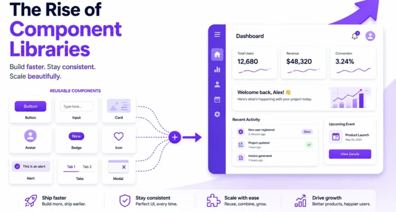
Look at almost any app or website you use. The buttons, the menus, the little toggles and pop-ups. Someone had to build every one of those. For years, developers built them by hand, again and again, on every single project.
Then component libraries arrived and quietly changed how the whole web gets built. Today, most of the interfaces you tap and click are assembled from these ready-made building blocks.
This article explains the rise of component libraries in plain language. We will look at what they are, the problem they solved, how they grew into today’s headless and own-your-code tools, and where they are heading next. No heavy jargon, just the full story.
Here is the short version. A component library is a ready-made kit of interface pieces, like buttons and forms, that developers reuse instead of rebuilding from scratch. They took off because they make interfaces faster to build, more consistent, and more accessible. The newest wave even lets you own and edit the code, rather than importing a rigid package.
1. What Is a Component Library?
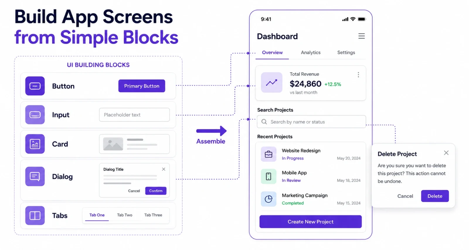
A component library is a collection of pre-built, reusable interface pieces. Think buttons, input fields, dropdowns, dialog boxes, tabs, and tooltips, all designed to look and work well together.
Here is a simple way to picture it. Building an interface without a component library is like carving every piece of furniture for a house from raw wood. A component library is more like flat-pack furniture. The pieces are ready, tested, and consistent, so you spend your time arranging them, not making them.
Each component quietly handles three jobs at once: how it looks, how it behaves when you interact with it, and how it works for people using assistive technology like screen readers. That last job is harder than it sounds, which is a big reason these libraries matter so much.
2. Life Before Component Libraries
To see why they rose, it helps to remember the pain they removed.
In the early web, developers hand-coded every element. A button on one page might look and behave differently from a button two pages over. Teams reinvented the same dropdown a hundred times, each version slightly broken in its own way.
Worse, the tricky details were easy to get wrong. Keyboard navigation, focus handling, and screen-reader support were often skipped completely, which left many sites hard or impossible to use for people with disabilities.
The result was slow, inconsistent, and fragile. There had to be a better way, and there was.
3. The First Wave: Batteries-Included Libraries
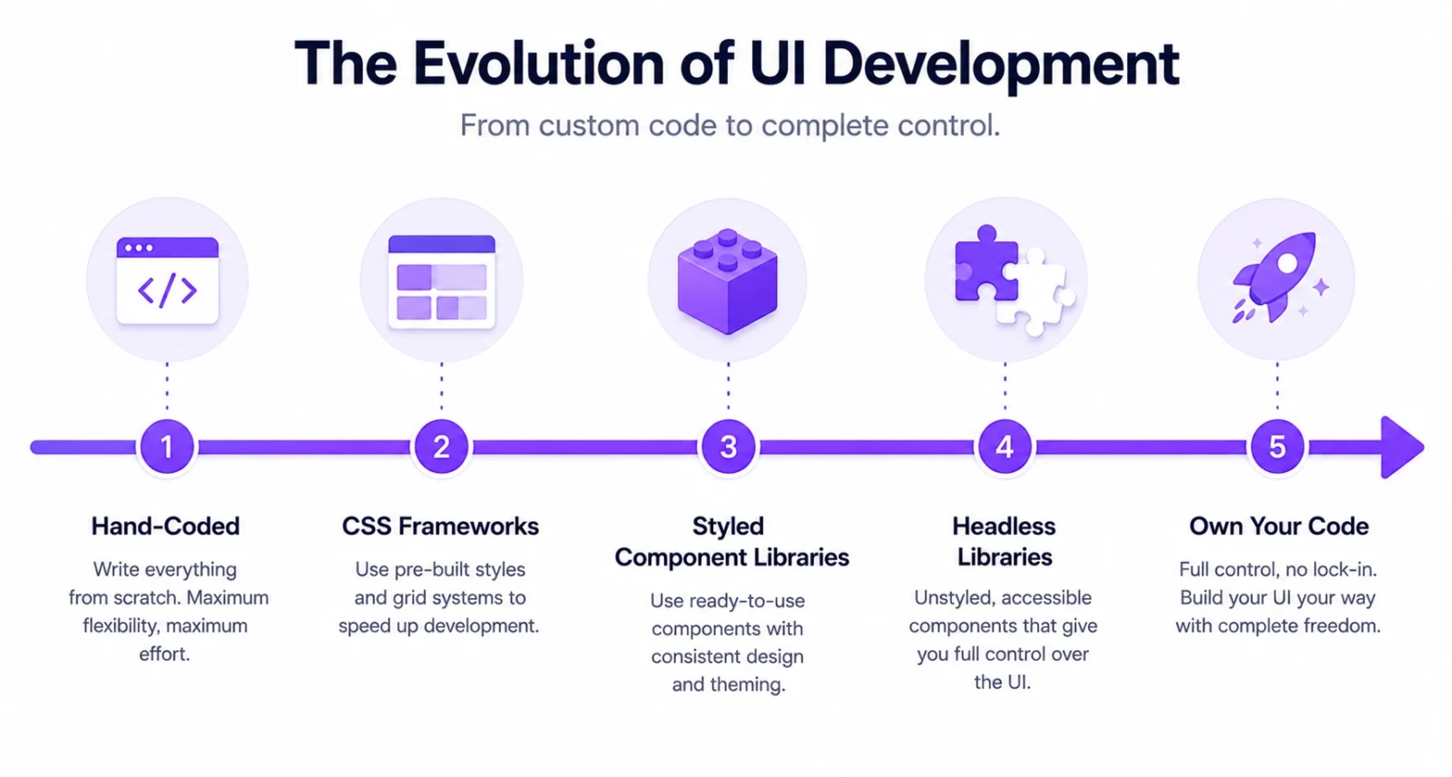
The first big answer was the all-in-one, pre-styled library.
Bootstrap, released in 2011, let developers drop in good-looking buttons, forms, and layout grids instantly. Suddenly a small team could ship a tidy, consistent site in a weekend. When React made the component model popular, libraries like Material UI, Ant Design, and Chakra UI took the idea further, offering whole sets of polished, ready-styled components out of the box.
This was a huge leap forward. But it came with a catch. Because everything arrived pre-styled, sites built this way often looked the same, and shaping them to match your own brand usually meant fighting the library with override after override. Developers started calling it a straightjacket.
4. How Component Libraries Help You
So what does all of this mean for you, whether you are a developer, a designer, a founder, or someone building with AI tools? Quite a lot, as it turns out.
- You build and launch faster. You assemble a working interface from ready parts instead of making each one, which can turn weeks of work into days.
- Your product looks professional without a designer. The components arrive polished and consistent, so even a solo builder can ship something that looks the part.
- Accessibility is handled for you. Keyboard support, focus handling, and screen-reader labels come built in, which is better for users and increasingly required by law.
- You can prototype in an afternoon. Test a real, clickable idea before investing weeks, then keep what works.
- You can learn from real code. Modern libraries ship clean, well-written components you can read, copy, and learn from.
And you do not need to be a senior engineer to benefit. Beginners, indie makers, small teams, and even non-coders using AI builders all gain, because the hard parts are already solved for them.
This is also why they pair so well with modern AI coding tools. Our roundup of AI tools that programmers use shows how much of the work is now assembling and generating, rather than hand-coding from nothing.
5. The Big Shift: The Rise of Headless and Owning Your Code
The straightjacket problem set up the next move, and it is the most interesting part of the story.
First came utility-first styling. Tailwind CSS let developers style components with small, mix-and-match classes, handing back full design control without writing piles of custom CSS.
Then came headless libraries like Radix UI and React Aria. These are clever. They handle all the hard behaviour, the accessibility, the keyboard navigation, and the focus management, but leave the look entirely to you. You get the tricky engineering for free and still design your own brand from scratch.
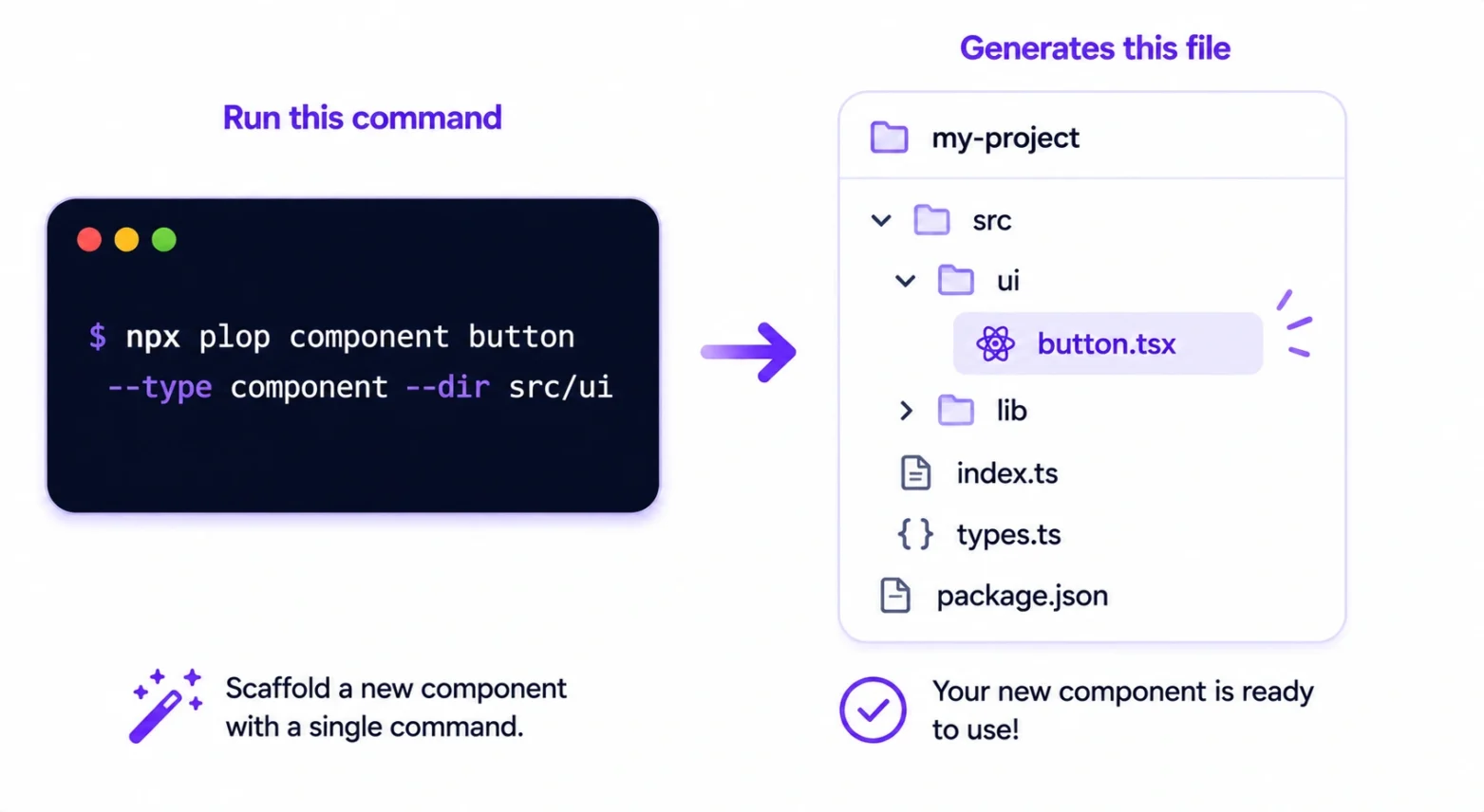
The real turning point was shadcn/ui. Instead of installing it as a package you import, you run a command and it copies the component code straight into your own project. You own that code. You can edit it freely, and there is no hidden dependency to fight or to update against your wishes.
Developers loved it. According to the JavaScript Rising Stars rankings, shadcn/ui was the single most popular project of both 2023 and 2024. The simple idea of owning your components, rather than importing them, turned out to be a genuine game changer.
6. The Component Library Landscape in 2026
Today the choices sort into three layers, and strong teams often mix them on the same project.
| Type | What It Is | Examples | Best For |
| Styled, all-in-one | Pre-designed components, ready to use | Material UI, Ant Design | Dashboards and internal tools, built fast |
| Headless primitives | Behaviour and accessibility, you add the look | Radix UI, React Aria, Base UI | Custom designs that must stay accessible |
| Own-your-code | Components copied into your project to keep and edit | shadcn/ui | Teams wanting full control and no lock-in |
The clear trend is toward the second and third layers. Headless and Tailwind-first tools are growing the fastest, partly because modern frameworks reward interfaces that send less code to the browser. One telling sign of the shift is that even the makers of Material UI now offer a headless option called Base UI, which shadcn/ui can build on top of.
7. Which Component Library Should You Use?
There is no single best choice. The right one depends on your goal, the framework you use, and how much control you want. Use this quick guide to point yourself in the right direction.
| If you want to… | Try this | Why it fits |
| Ship a clean app fast with little CSS | Chakra UI or Mantine | Polished, friendly, and easy to theme |
| Build dashboards and data tables | Material UI or Ant Design | Huge component sets and strong data grids |
| Own your code and match your brand | shadcn/ui | Copies editable components into your project |
| Get accessibility without a fixed look | Radix UI, Base UI, or React Aria | Behaviour and a11y handled, you style it |
| Add components to a plain HTML site | Bootstrap | No framework needed, the easiest start |
| Have AI build the UI for you | v0 by Vercel | Generates editable, shadcn-style components |
A few notes to guide the choice. If you are just starting out and want something that looks good immediately, Material UI or Chakra UI are friendly picks. If you care about a unique brand and full control, the modern favourite is shadcn/ui, which builds on accessible primitives like Radix UI. And if you would rather describe what you want and let a tool build it, v0 generates real components you can keep and edit.
Not using React? The same idea exists everywhere. Vue has Vuetify, PrimeVue, and Nuxt UI. Angular has Angular Material and PrimeNG. Svelte has Skeleton and Flowbite. Pick the popular library for your framework and you get the very same benefits.
8. How to Try One in Five Minutes
The fastest way to understand component libraries is to use one. Here is the shortest path for the two most common starting points.
If you use React with Tailwind, try shadcn/ui:
- In your project, run the setup command.
npx shadcn@latest init
- Add a component, for example a button.
npx shadcn@latest add button
- The code appears in your project at components/ui/button.tsx. Import it, use it, and edit it however you like.
If you want ready-styled components with no fuss, try Material UI:
- Install it in your React project.
npm install @mui/material @emotion/react @emotion/styled
- Import a component, such as Button, and drop it straight into your page.
Prefer no code at all? Open v0, describe the screen you want in plain English, and it will generate components you can copy into a project. For a guided, AI-assisted way to do this inside your editor, see our Claude Code beginner’s guide.
9. The Trade-Offs, and What Comes Next
No approach is perfect, and it is worth being honest about the costs.
- The sameness problem. When everyone reaches for the same library and its default look, a lot of the web starts to feel identical.
- You own the upkeep. With the copy-paste model, the code is yours, which also means fixes and updates become your job.
- Big all-in-one libraries can add a lot of size to a page, which can slow it down if you are not careful.
As for the future, the next wave is already arriving, and it is AI. Tools can now generate working components from a plain description, and the own-your-code approach fits this perfectly, since the AI simply writes code that you keep and adjust.
We saw a hands-on version of this in our guide to designing landing pages with Claude, where an AI assembles real interface sections on request. Whatever comes next, the core idea is here to stay. Nobody wants to hand-carve the same button forever.
Frequently Asked Questions
What is a component library in simple terms?
It is a ready-made kit of reusable interface pieces, such as buttons, forms, and dialog boxes, that developers drop into their apps instead of building each one from scratch. The library handles how each piece looks, behaves, and works for accessibility.
Why are component libraries so popular?
They make interfaces faster to build, consistent across a whole product, and accessible by default. They also give designers and developers a shared language of named components, which is the basis of a design system.
What does a headless component library mean?
A headless library handles a component’s behaviour and accessibility, things like keyboard navigation and focus, but leaves the styling entirely to you. You get the hard engineering for free while keeping full control of the design.
What makes shadcn/ui different?
Instead of installing it as a package, you copy its component code straight into your own project. You own and can edit that code directly, with no hidden dependency to manage or update against your wishes.
Are component libraries free?
Most of the popular ones, including Material UI, Chakra UI, shadcn/ui, Radix UI, and Bootstrap, are free and open source. Some offer paid premium add-ons, such as advanced data grids or ready-made template packs, but you can build complete apps without paying.
Are component libraries only for React?
No. React has the richest ecosystem, but Vue, Angular, Svelte, and even plain HTML and CSS all have component libraries and similar tools. The same ideas apply across the whole web.